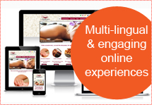
They required a new look and feel for their website along with a personalized area based on the user’s data and research requirements.
The 360 digital in-house team developed wireframes, which were then transformed into creative visual concepts.
A innovative approach to design
From the beginning we wanted to make this a memorable design. So we went with an unconventional – split of the page. In the left-hand side we focused on a few key messages and updated the calls to action. A quick glance and you can’t miss what you’re supposed to do. It’s all about focusing the user and driving them to the funnel.
Delivering principles in response to business requirements
With concepts finalized the designs were developed into editable PSDs and finally coded into CMS, so that Event box team can edit the site of their own.
In one month wireframes were altered into a creative and realistic design that met the objectives, at the same time as remaining uniform with the existing branding.
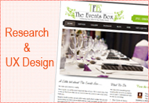
Multiple visual concepts ensured that ‘The Event Box’ was provided with a variety of designs to pick from. This helped them to form a look and sense that matched their business perfectly.
Multiple visual concepts to shape the way forward
If you would like to see how we could achieve these results for your business, please get in touch.

 +91 7420018003
